Nora Ephron tells the story of when she first fell in love with journalism.
Her journalism teacher, Mr. Simms, asked the class to write the lead for an article using these facts:
“Kenneth L. Peters, the principal of Beverly Hills High School, announced today that the entire high school faculty will travel to Sacramento next Thursday for a colloquium in new teaching methods. Among the speakers will be anthropologist Margaret Mead, college president Dr. Robert Maynard Hutchins, and California governor Edmund ‘Pat’ Brown.”
The class followed the “who / what / where / when / why” rubric they’d learned to create leads about the colloquium and its agenda, all of which Mr. Simms rejected.
The lead, he finally explained, was “There will be no school on Thursday.”
That was when Ephron learned that “the point” was more important than the details.
With that in mind, if the Google Ads interface were in a journalism course, it’d probably fail.
The charts and tables in Google Ads provide an overwhelming amount of facts and data, but don’t distinguish between high and low importance. Instead, the interface jumbles everything together, often leaving out key information and focusing on the trivial.
In this article, you’ll learn how to turn that around.
Even though the “factory settings” bury the lead, key details reveal the hook of your data story hidden in the Google Ads interface.
Fire up your Google Ads account, and let’s dive in.
1. Un-bury the lead
Just like young Ephron and her journalism classmates, Google Ads will give you a lot of details without ever getting to the point.
Your mission is to find what matters most, and make that the focus of your tables and charts.
If you feel overwhelmed just looking at all the data and metrics in the Google Ads interface, start here:
Fix your overview summary card
The summary card in your overview page features unimportant metrics by default.
Here we see a card with clicks, impressions, CPC, and cost. Most likely, none of these are your most important metrics, so why would you feature them on an overview card?

How to fix the overview summary card
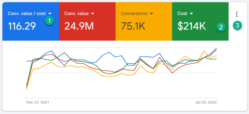
- Click the drop-down arrow next to each metric to change it.
- Click the background of the scorecard to toggle between adding or removing it from the chart.
- Click the three dots in the upper right corner to change the date segment or download the data.

Simply switching your metrics to your key performance indicators (KPIs) already makes the card much more useful.
Most clients don’t care how many clicks they got, but they care very much that they drove $25 million in revenue, and how that metric is trending.
Setting your card to reflect your KPIs helps you know whether you’re on track to hit your targets, and where to dig deeper.
Fix your statistics table
As with the overview summary card, the statistics tables in the Google Ads interface aren’t calibrated to help you find the point.
In English, we read left to right, so the most important metrics should be on the left.
But are they?
If looking at your metrics in the interface makes your eyes glaze over, you probably don’t have your columns organized correctly.

How to add and arrange columns
- Click on Columns and select Modify columns from the drop-down.
- Modify or customize columns to reflect your key metrics.
- Reorder columns to lead with the most important.
- Hit Apply to save.
While modifying columns isn’t a deep secret of the Google Ads interface, it will give you a huge edge in your account optimization if you aren’t doing it already.
Reviewing a statistic table setup like this makes it almost impossible to know what to do next:

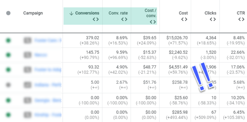
After arranging the columns and adding a time period comparison, it’s a different story:

You can immediately tell which campaigns are performing well, compared to each other and compared to last year.
Prioritize the most important info to make better decisions in the account, and prevent that feeling of dread when you’re just staring at data but have no idea what to do next.
2. Decouple your conversion actions
We’ve established that prioritizing Google Ads conversions in the interface will make it easier for you to optimize.
But not all conversions are created equal.
That’s because “conversions” aren’t a standardized metric, and can refer to different actions with different values for your business.
Any of these can be tracked as a conversion in Google Ads:
- A sale
- A page view
- A download
- A phone call
- A link click
It’s up to the advertiser to define which actions are tracked as conversions, but by default, all conversions are rolled up and reported on as a single activity.
Here we see a Google Ad statistics table with 358 conversions, for a nice CPA of only $5.19:

But what exactly are the conversions that are shown here?
To find out, go to Segment and select Conversions > Conversion action.

It turns out that less than 4% of conversions were actually for booked demos, the company’s primary KPI. The remaining 96% of conversions were page views (About Us, View Pricing) which were automatically imported into the account and tracked as conversions:

The actual CPA for a booked demo isn’t $5 but $142. ($1,857 divided by 13 demos.)
Applying this segment can help you quickly get to the bottom of which conversions are being tracked and how each performs at a campaign level, so you can fix your tracking or change your optimization strategy.
It may not be the story you want, but it’s the story you need.
3. Are you really 'message matching' (or do you just think you are)?
You know what message match is. It's when the keyword, ad and landing page are all about the same thing.
Also known as "congruence," message match is critical for improving your quality score, boosting your performance, and keeping the attention of your prospects.
But getting every single keyword in alignment with every single ad is no small thing, especially now that responsive search ads (RSAs) introduce so much variation to ad text. (Maybe the keyword matches perfectly on versions 1,2 and 4 but bombs on version 3.)
Here's how to tell if your keywords and ads are aligned.
Segment your ads by keywords
In your Ad page's statistics table, go to Segment > Keyword text.
In this view, you'll play a game of "one of these things is not like the other" to see if all your keywords are performing similarly, or whether there are any outliers.

The table above shows that the brand "promo" ad is doing great on searches for discounts and coupons, but "sales" isn't driving any sales. Not only that, the CTR is only 7%, which is far below the average 25% for this ad.
So what now?
You could:
- Pause the keyword.
- Edit the ad.
- Create a new ad group that better emphasizes the keyword in the ads.
Any of these options could be the best choice for improved message match, it all depends on the keyword, ads and offer.
4. If you don't segment ad extensions, your data will be wrong
Is there any part of the Google Ads interface that's as misleading as Extensions tables? This table goes beyond "burying" the lead and makes it disappear completely.
For example, let's pop in to check on how our "Gift Cards" sitelink is performing.

Looks great, right? $1.6 million in revenue, 73K clicks – this extension is on fire!
You know where this is going. Head over to Segment and select This Extension vs. Other. Now let's have another look at the performance:

Turns out the sitelink only got 64 clicks, driving less than $2K in revenue.
The rest of the performance data relates to the headline or literally any other part of the ad that wasn't the sitelink, but served when the sitelink served.
By default, the table will show you incomplete or inaccurate data about your extensions. Always use This Extension vs. Other for a true evaluation of performance.
Channel your inner journalist
Like an investigative journalist, you can learn to uncover the lead, and focus on what matters most in your account.
The Google Ads interface is constantly changing, without much announcement or fanfare. This article only scratches the surface of what you can uncover.
For instance:
- Find out how mobile landing pages affect your conversion rates by segmenting landing pages by device type.
- See if Search Partner volume has changed by segmenting for Network (with search partners).
- Filter your search term data by search term text to quickly see the spread of keywords triggered by similar queries.
Be curious, and see how you can use new filters, segments, columns and report features. You'll be an expert in getting to the point of your data in no time!
The post 4 tips to get the most out of the Google Ads interface appeared first on Search Engine Land.
via Search Engine Land https://ift.tt/wVe2a78

No comments:
Post a Comment